How to Master Data Storytelling: A Scholar’s Guide to Winning Research Grants
A $5 million NSF grant for data storytelling and visualization software highlights this skill’s growing value in research.
Prestigious fellowships now target data storytellers from Latin America, the Caribbean, Asia, and Africa. This shows that becoming skilled at data storytelling isn’t optional – it’s crucial to win research grants. The Storytelling with Data Fellowship gives researchers practical training in data analysis and visualization. Your grant application’s success often depends on how well you present your data story.
SAGE software’s evolution spans 16 years of continuous NSF funding, which proves how important it is to turn complex data into engaging narratives. Your ability to shape data into a compelling story could help secure your next research grant, regardless of your research experience.
Let’s take a closer look at proven strategies that will help you tell better data stories and improve your chances of winning research funding. These techniques can turn your grant applications from good to outstanding.
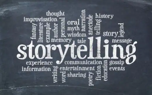
Understanding Data Storytelling Basics
Data storytelling goes beyond simple data visualization by blending three key elements: data analysis, compelling narratives, and visual representations. Harvard Business School explains that data storytelling helps us share dataset insights through narratives and visualizations that drive action.
The art of data storytelling uses the same building blocks as any captivating story – characters, setting, conflict, and resolution. The process starts by identifying the people affected by the data and the audience’s connection points. The next step grounds readers in specific context and explains the importance of achieving goals right now. Creating tension comes next by highlighting a problem that needs solving and ensuring emotional investment through high stakes. The final piece showcases data insights as the solution to our protagonist’s challenge.
The human brain processes stories differently than raw data. Stories activate multiple brain regions at once – Wernicke’s area handles language comprehension, the amygdala manages emotional responses, and mirror neurons create empathy. Nobel laureate Daniel Kahneman captured this perfectly: “No one ever made a decision because of a number. They need a story”.
Success in data storytelling depends heavily on context. Raw numbers transformed into graphs mean little without background information that helps stakeholders grasp the data’s significance. This becomes especially valuable when complex information needs to reach audiences unfamiliar with data analysis.
Data storytelling has evolved far beyond traditional spreadsheets and graphs. Historical records show data visualization existed since the 1500s, with qualitative and quantitative data woven into textiles, government treaties, and ceremonies. This rich heritage shows us that effective data communication can take many forms and makes complex information easier to understand and act upon.
Crafting Your Data Narrative
Data storytelling succeeds by blending creativity with analytical thinking to turn complex information into compelling narratives. Organizations can show their programs’ necessity and initiatives’ effects by backing proposals with empirical evidence.
Clear objectives for data analysis must link to specific goals. This method helps us track outcome and behavior changes over time. The overall narrative becomes richer when qualitative data from interviews or focus groups adds deeper insights into participant experiences.
Your audience will connect emotionally with a main character whose conflict mirrors their own tension. This human element makes statistics more relatable and shows the ground implications of funding decisions.
Visual elements serve a significant role to boost comprehension. Charts, graphs, and infographics make data more available and engaging. The right visualization choice matters:
- Bar charts excel at comparing quantities across categories
- Line graphs effectively show changes over time
- Heat maps display distribution and density patterns
Visuals need strategic placement to complement rather than overwhelm the narrative. Color schemes that line up with organizational branding boost visual appeal while keeping consistency.
Clear and concise labels, legends, and titles help viewers interpret information easily. Accuracy takes priority because misrepresented data can create stakeholder mistrust.
Mixed methods approaches give the most detailed understanding by combining qualitative and quantitative data. This integration creates a balanced narrative that emphasizes measurable outcomes and personal transformations.
Statistics should flow throughout the proposal instead of sitting isolated in one section. The result is a cohesive story that shows your mission’s urgency and proposed solution’s potential effect.
Transform Data Into Grant Success
Research outcomes significantly influence grant funding success. A compelling narrative that presents data effectively shows the potential value of research projects.
NIH now requires researchers to submit detailed data management and sharing plans with their grant applications. Clear metrics and assessment criteria help showcase research outcomes well. Tools that make use of information apply consistent metrics to applications, which ensures fair assessment and reduces biases.
Grant applications become stronger with specific data that demonstrates:
- The scope of needs addressed
- Program value in numbers
- Results you can measure
Analysis of past grant data helps funders spot patterns of success. Grant managers can track KPIs and create analytical reports that show program results.
The peer review process must protect confidentiality. NIH uses multiple safeguards to protect review integrity. Professional interactions between applicants and reviewers continue during proposal assessment.
Working with collaborators and the core team helps create effective responses to reviewer comments for resubmissions. Program Officers at study section meetings can explain how to tackle specific reviewer concerns.
Assessment criteria should match funding program goals. Claims about results need to focus on measurable outcomes and medium-term effects rather than long-term projections. This approach leads to better proposal assessment by looking at:
- Effects based on use and experience
- Creation and co-creation of results
- Realistic timelines for reaching stated goals
Numbers mean nothing without context. Short statements that explain metric importance make grant applications stronger. Researchers present their work best when they focus on both quantity and quality metrics without using journal impact factors.
Conclusion
Data storytelling helps turn complex research data into engaging narratives that win grants. Our research shows how mixing analytical thinking with storytelling techniques creates persuasive grant applications that appeal to reviewers.
Strong evidence suggests successful grant proposals rely on knowing how to present clear metrics with proper context. Numbers alone don’t tell the whole story. We need to craft narratives that show real-life effects and match funding program goals.
Becoming skilled at data storytelling takes practice and commitment. The process might feel daunting at first. These strategies will help you create more compelling grant applications. Note that effective data storytelling needs more than just attractive visuals. You need thoughtful analysis, clear metrics, and meaningful context to showcase your research’s full potential.
Your grant applications must emphasize measurable outcomes while preserving data integrity. The key to success lies in striking the right balance between engaging narratives and accurate data representation. This approach helps your research stories grab attention and build trust with funding organizations.